This great project covers what SO MANY clients are looking for: great curb appeal that isn’t high maintenance, but is unique and special.
We invest so much into our homes, and it matters: how they appear from the street, what you see when you get out of the car, how the house is frame and highlighted by the landscaping. Front gardens are GARDENS, not “landscaping”… I mean they are intentional, dynamic, living spaces rather than static, boring, cookie-cutter foundation beds.
This project is a great example. The home is a low-slung ranch in an established neighborhood in West Des Moines. Trees planted two decades ago have become large shady structures that have changed the front entry dramatically. These homeowners have invested in a new driveway and wanted to work on the front garden while they were at it.
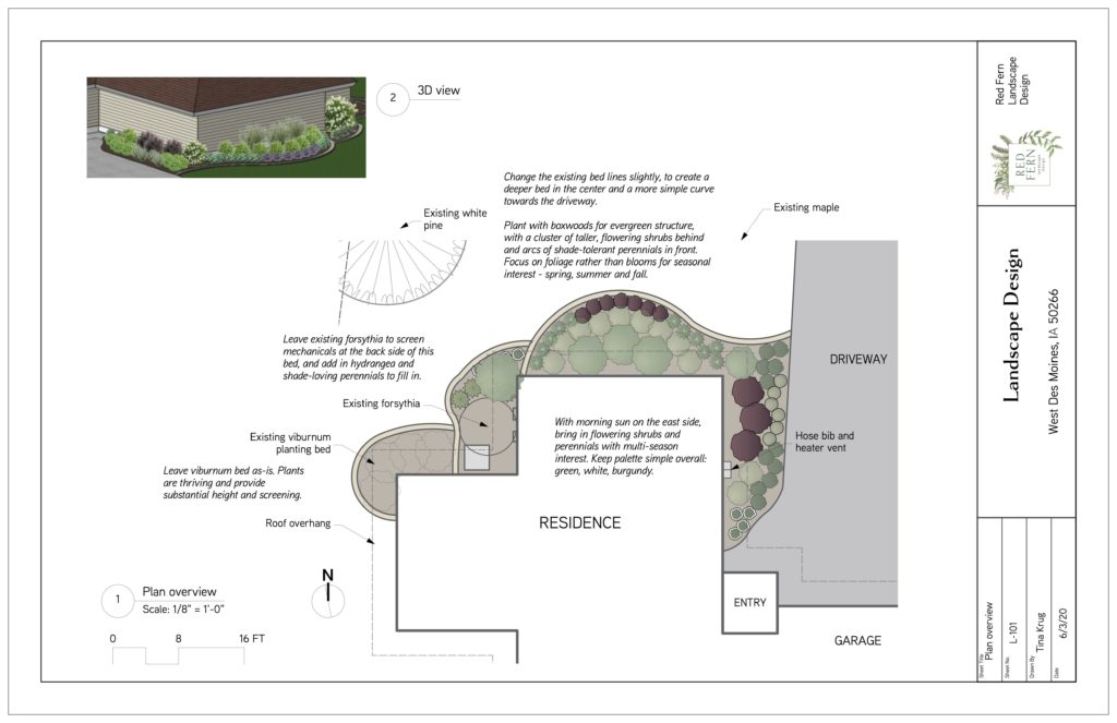
The plan was to increase the size of the front bed to allow for layered plantings that will bring color, texture, height and scale to the front. The house has large roof soffits creating a deep overhang, so we wanted to bring the existing plantings out from against the house to accommodate it.
We also created a broad curve in the bed line from the driveway around the front of the house, to allow for larger plantings and more visual interest.
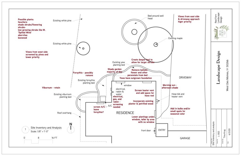
Our Site Inventory and Analysis stage captures all relevant information about the property: slope and drainage, views from all directions, screening needed, mechanicals and water accessibility, existing plants’ locations and status, exposure and sun/shade patterns. This information drives our design plan. We are big believers in form following function! Beauty doesn’t matter if the space doesn’t work correctly. The site inventory and analysis work gives the scaffolding we need to drape the beautiful design work onto.
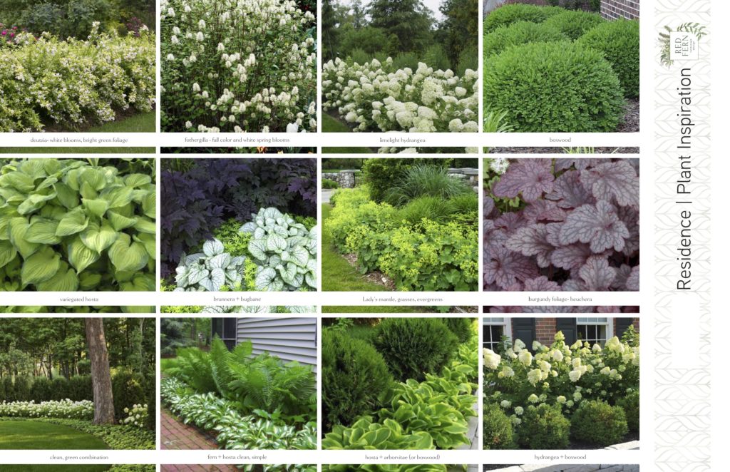
Speaking of beauty, the plant inspiration board is so much fun! We look at which plants can tolerate the site AND fulfill the design intent we’ve learned from meeting with our clients. This project lands in a shady, established home with homeowners who have a cultured, traditional aesthetic. We wanted to create clean lines with more preppy, classy plantings, using foliage and texture right alongside color. This ensures we’ll have interest as many months as possible.
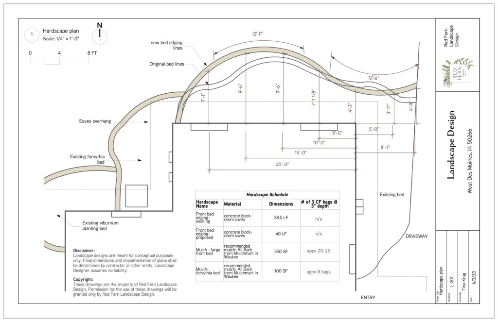
Our clients for this project were do-it-yourselfers, so they needed just a little direction for the changes to the site. In this hardscape plan you can see the original bed lines outlined in black. The new bedlines are shaded tan, and really come across far better. The new bed has a strong curve that highlights the front of the house and balances the existing windows. The old bedlines had unnecessary squiggles! Any of my clients have heard me go on and on about squiggles. I don’t need perfectly straight lines and right angles, but I do believe that a curve better have a job to do. So we took out the old squiggles and traded them for two curves: from the driveway we created a strong curve that will draw the eye towards the planting bed and welcome people to the house. The large curve across the front of the house highlights the space between the two windows, creating room for large, showy flowering shrubs.
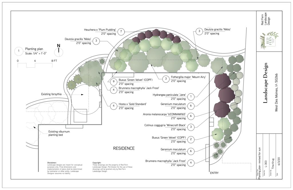
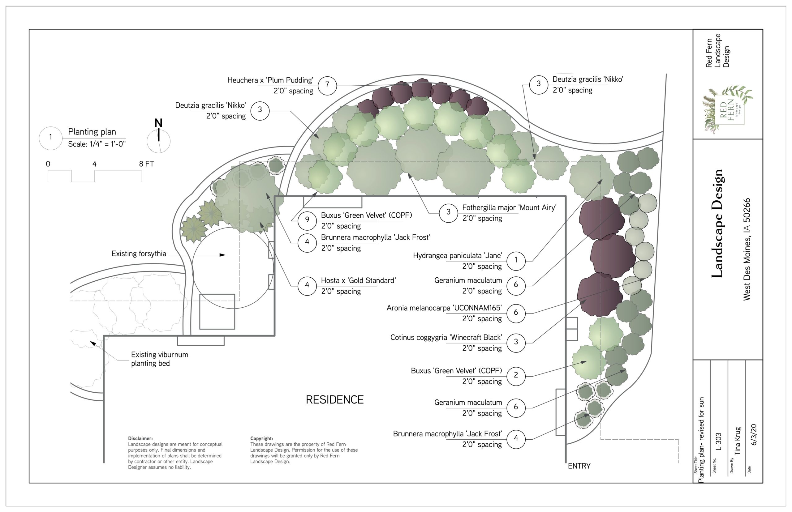
A planting plan for a part-shade, mostly preppy, classic styled garden space. We’ve balanced evergreens (boxwood) for year-round structure with large flowering shrubs (aronia, smokebush, hydrangea and fothergilla) to create the backbone. Low-growing shrubs (one of my favorite categories of plants) and perennials finish off the front layer by bringing color, texture and interesting forms. Deep purple foliage color ties the front in with the sunnier east side, and most of the other plants bloom white.
I love using white-flowering or white-varigated plants near an entry. It’s dark in Iowa for more of the year than it’s light out, so we need to make the most of the limited light we have. White plants show up in low light so nicely.
Like the majority of our clients, these homeowners wanted their front yard to set off their house and create an appealing entry. This garden space is lush with layers of green. Each planting area has purpose and intention. The front architecture is highlighted, set off by the garden space. Just a few important changes have created beautiful front curb appeal for this lovely home.
LIke it
pin it
tweet it
email it