


I am fascinated with the way our surroundings impact our movements. We take cues from architecture, color, pattern, materials, etc… and move accordingly. Long, narrow spaces cause us to move quickly. Repeated patterns and high contrast signal to our brains that it’s time to pick up the pace. Less contrast and open spaces encourage gathering and slowing down. At the Charlotte airport recently, the floor pattern in the rental car corridor caught my attention. The flooring in this area is amazing! It is designed for people to subtly understand when, where, and how to move – without signs! Let’s take a stroll through this area and see how the design works.
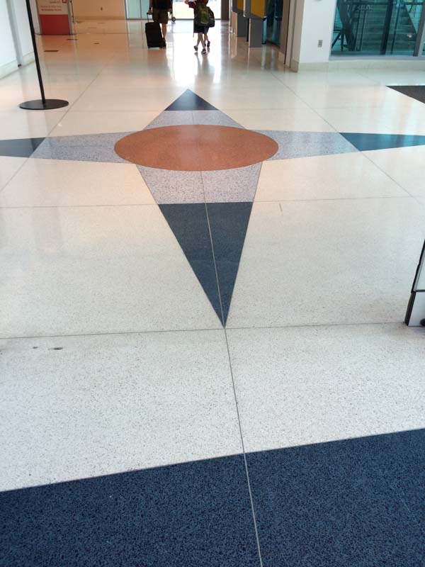
When you come off the escalator or come in from the doors, this compass-like pattern in the flooring greets you. This is a clear focusing spot – where you pause and consider your options. Decisions are made at places called nodes. And nodes aren’t helpful in a linear, high-energy place. You need a little time to think – and the space to do it. The circle surrounded by evenly sized points creates a square shape with a central core. Everything in this 15’x15′ space is encouraging you to slow down.


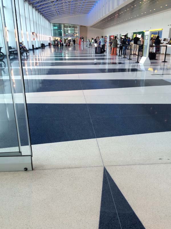
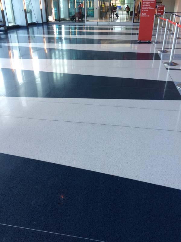
You make your decision to enter through the doors, and you’re greeted by this striped floor pattern. People walk through here, wait in line, and (finally) approach the rental car counters. The flooring helps make all this happen. Triangular stripes of dark and light tiles encourage movement and increase the energy associated with the space. This is high contrast, lively territory! You’re supposed to walk through this part.
 Floor color detail
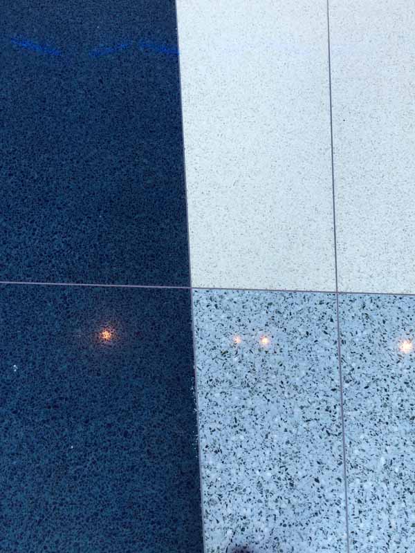
Navy blue, white, and grey were used for the flooring. This provides a slightly less harsh contrast than black and white would. Blue is a soothing, calming color and surely works overtime at the airport!
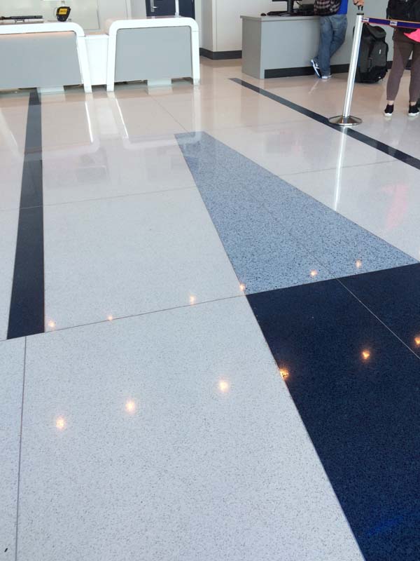
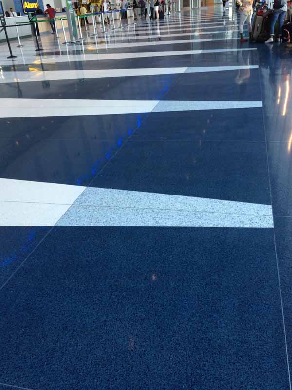
As you turn towards your rental car desks, you move off from the navy-white-corridor and into an area dominated by the white tiles. Some grey and navy remain, but the softer contrast and higher white percentage is far less intense. This keeps people calmer – what we all need in an airport. Long thin lines of navy delineate each area, and the triangles subtly direct people towards the desks. Brilliant flooring! How can we relate this to a client’s landscape? One of the primary considerations of any space is how it’s intended to be used: to move, to sit, to relax, to work… What’s under our feet, along with all the other elements of a design, should support the role of a space.


LIke it
pin it
tweet it
email it