Want to see a lovely transformation? This project took an absolutely stunning home with tired landscaping and created a beautiful, functional design without a lot of money, materials, or time. Quite the magic act!
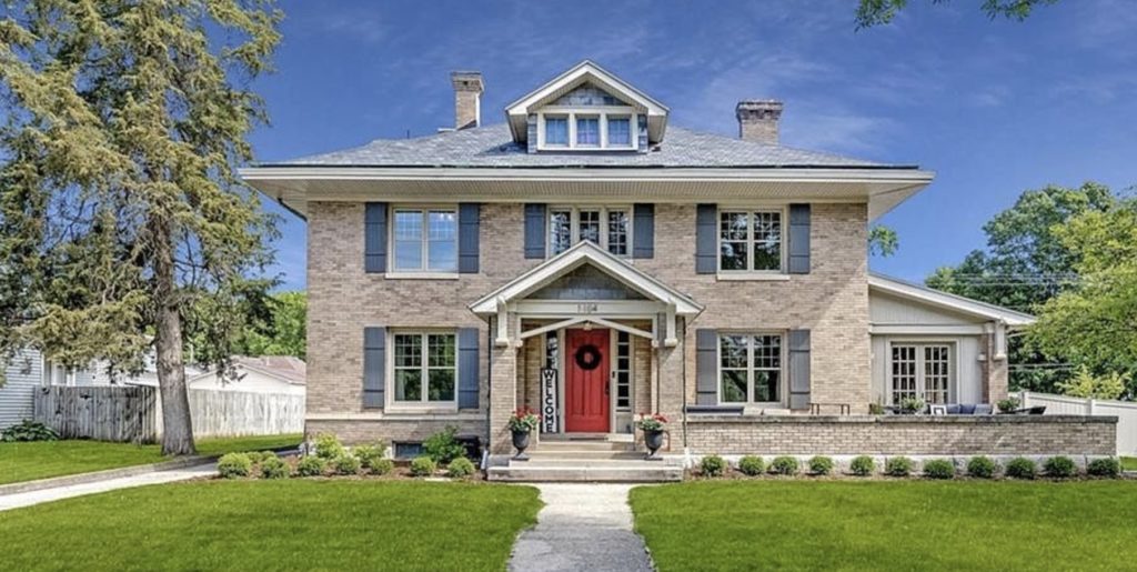
THE BACKGROUND
Some dear friends in Adel hired Red Fern to put together a plan for their 1910 home. They were unabashedly clear that they wanted LOW maintenance, few plants, simple landscaping, and a modest budget. We needed to design a landscape that would do justice to the historic home without breaking the bank for our clients.
The house sat on a large corner lot, really exposed all the way around. Privacy was a high priority because there are tons of walkers in the neighborhood.
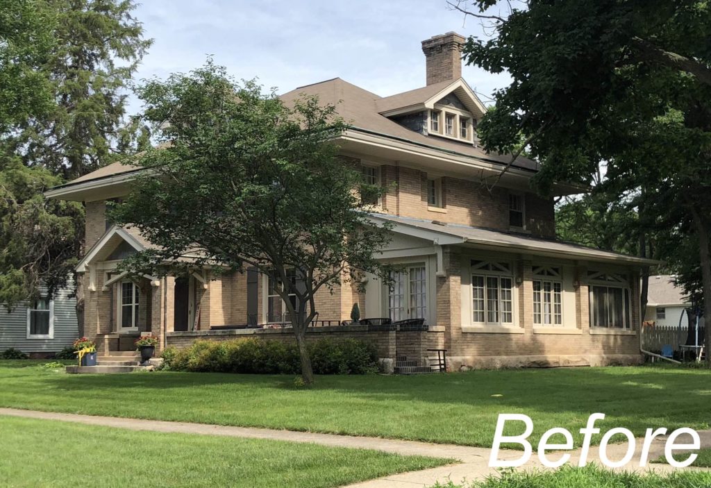
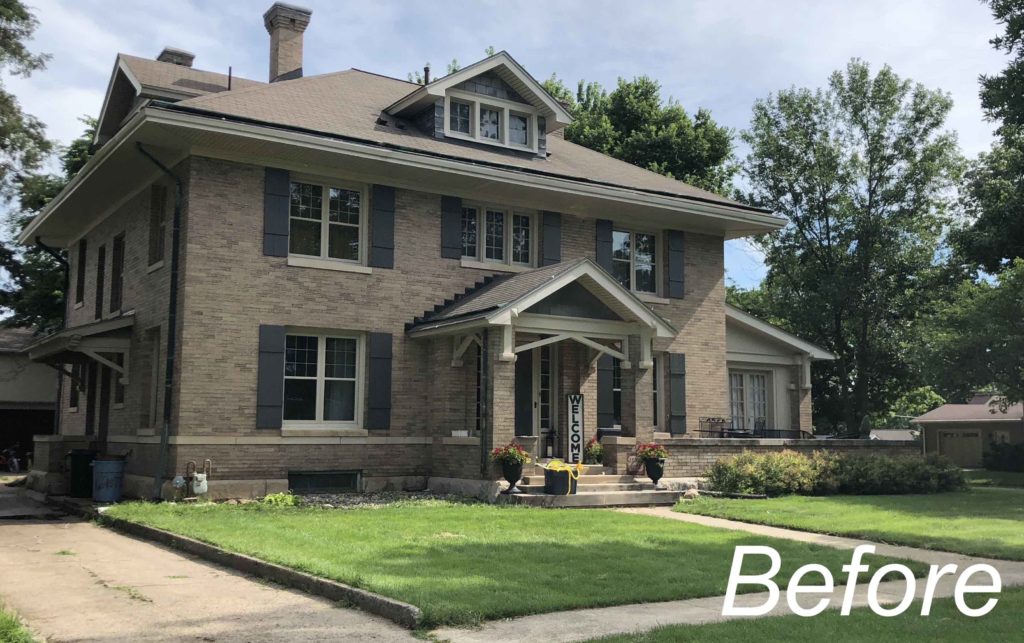
The front plantings needed attention. They had outgrown their beds and many plants died. The owners removed a large redbud that had been planted too close to the foundation. While they wanted simple, calming landscaping, they had no idea where to start or what plants to choose.
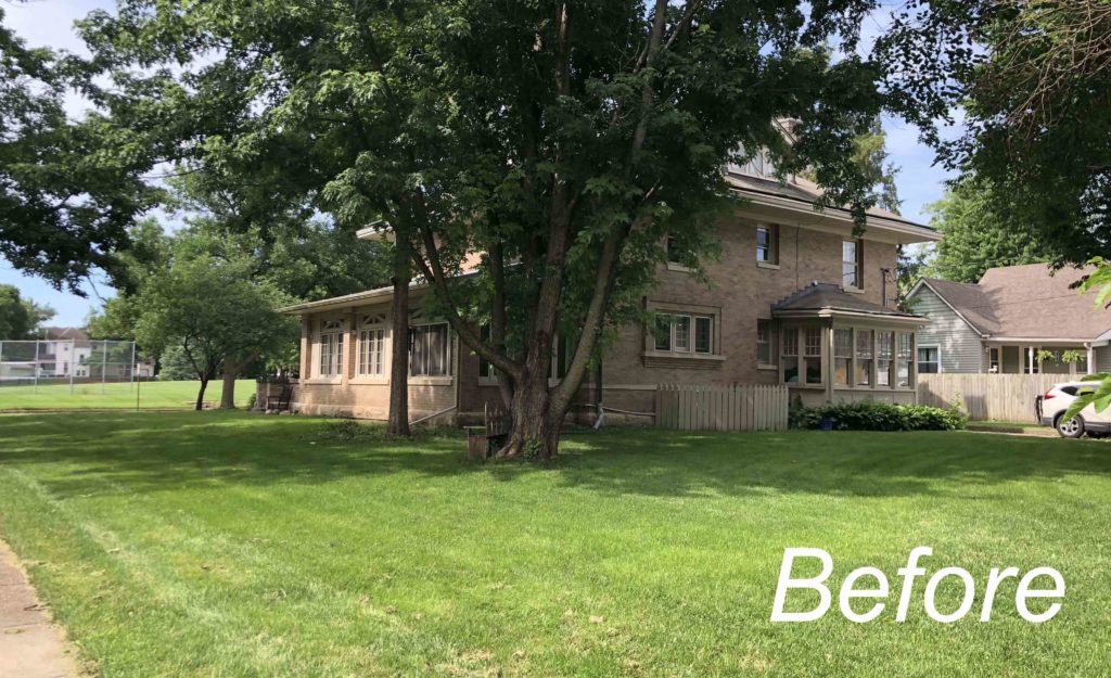
In the back yard, they also wanted simple landscaping. We needed to add the fence and determine its layout and style. The family wanted a space to hang out in the back yard right off the sunroom. Out in the yard, they hoped for a fire pit. We always evaluate the existing trees at a project. Here we found that almost all were unhealthy and needed to go.
As we talked more about the style they were hoping for and places that they loved to visit, we put together an inspiration board and plant palette. I LOVE it when clients know what they don’t want!
It’s okay to not know what you want… that’s why you hire a designer. But when clients can say firmly what they don’t want? That’s pure gold. We have something to work with!
In this project, we knew the maintenance realities. This active, busy family wanted their home to be a sanctuary. Major gardening was not on their fun list for a weekend, so we needed to plan for simple planting beds with plants that don’t ask for much.
The large, historic home definitely influenced my design aesthetic for this project. Beyond that, the family’s trips to Colorado and love of entertaining impacted the design. While this is a very traditional home, their taste ran towards modern and we wanted to include that in the exterior design.
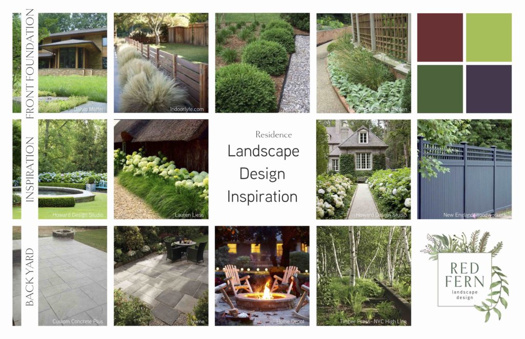
Clean, simple lines with large sweeps of plants were our goal. Calming, quiet landscapes that create soothing spaces – that’s what we were after. Some flowers, but really other than hydrangea, we knew grasses, foliage and texture were going to the the powerhouse.
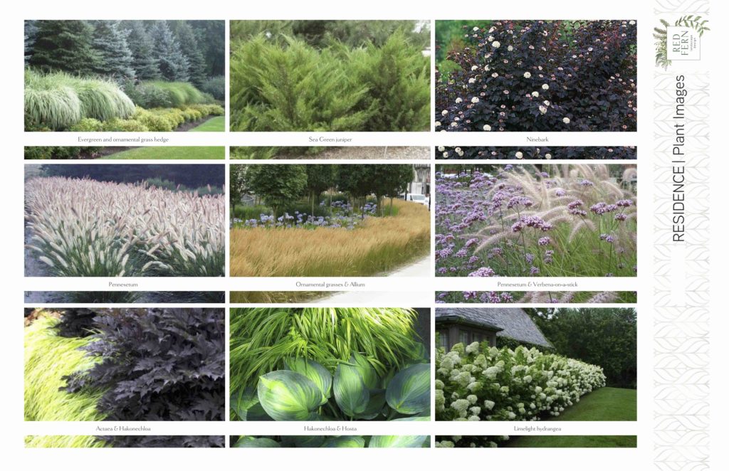
The plant palette echoes this design direction. Moody burgundy combined with classic green and white would give some punches of color, but overall the plants would be subdued.
THE DESIGN

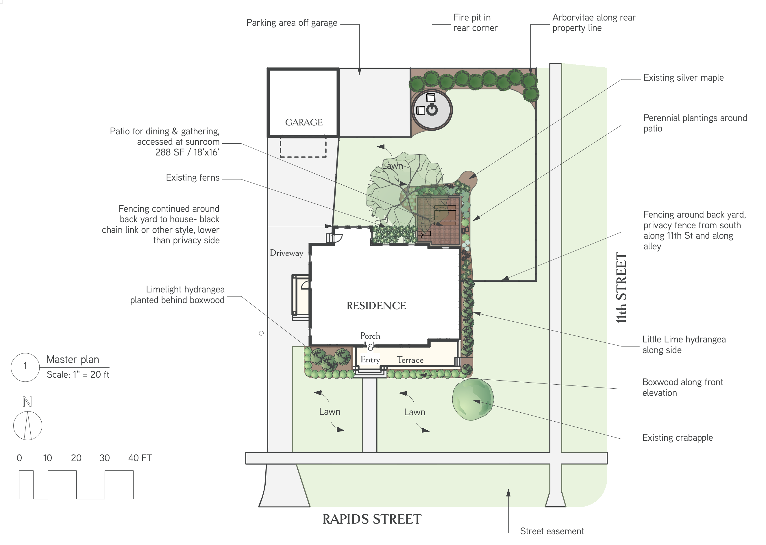
The master plan shows all the elements of the final design: Very, very simple plantings along the gracious front porch. A narrow row of hydrangeas against the east side of the home, leaving room for throwing the ball or playing with the dog. A privacy fence enclosing the back yard, so that the family could hang out without feeling like they were on display.
The back patio is accessed directly from the sunroom. It’s large enough to host friends but doesn’t take over the back yard.
In the back corner where the trampoline currently resides, we added a fire pit patio with evergreen plantings to soften the fence line. For now, the trampoline will stay until the kids outgrow it. Once that phase is over, the fire pit patio is planned and ready to go.
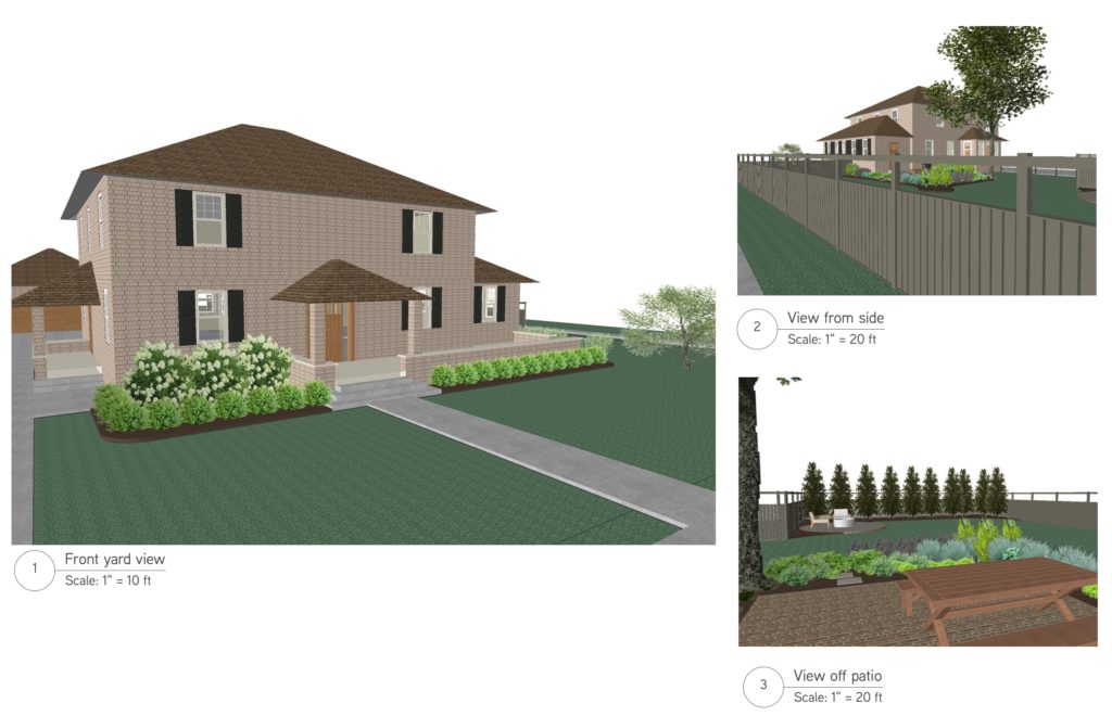
Working in 3D helps clients visualize the space as we’ve planned it. It helps all of us get on the same page about where the design is going. While the 3D images are never intended to be photorealistic, I’m always amazed at how closely the installed project resembles our drawings!
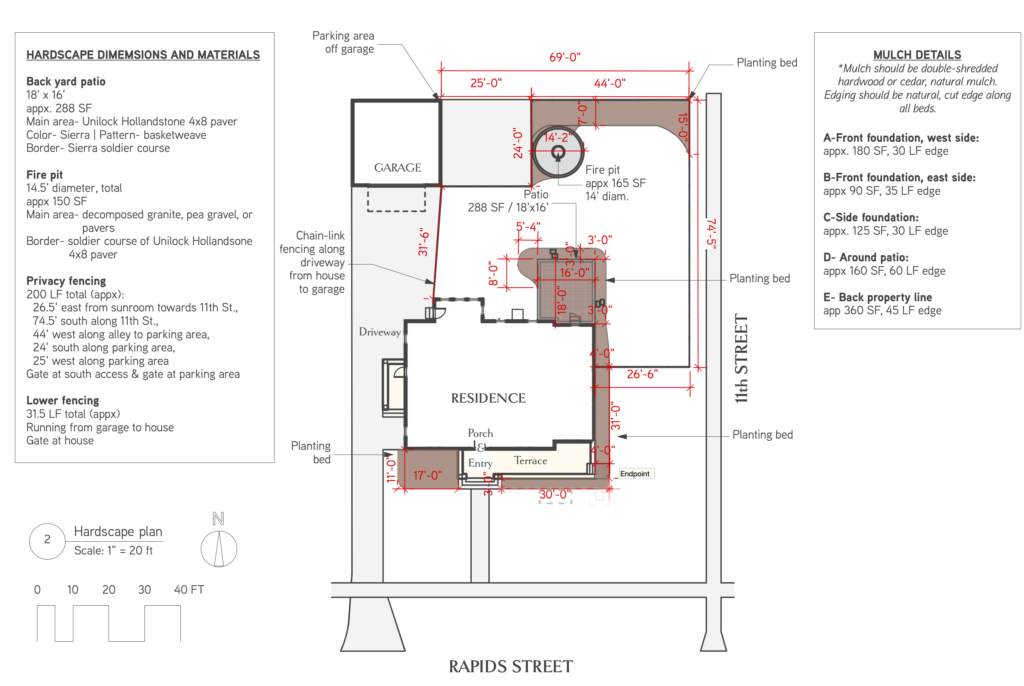
We detail all of our hardscape plans with as much information as possible. This helps the homeowners, the installers and anyone else involved in the project know exactly what we’re planning to use and where it’s going.
We also walk the “before” landscape with our clients, using spray paint, flags and rope to mark out the spaces and see how it all feels.
The hardscape details make bidding easier, planning simpler, and installation a dream.
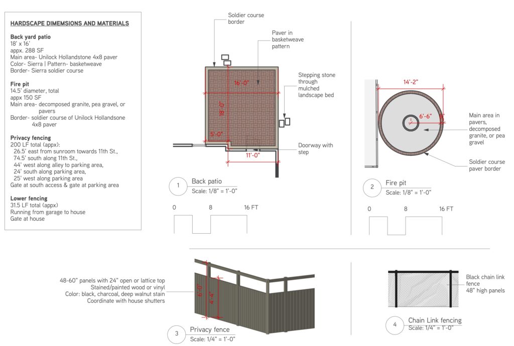
Besides the 2D view hardscape plan, we will detail out each element of the project. This sheet gives information about the materials used for each element and how much of it we’ll need.
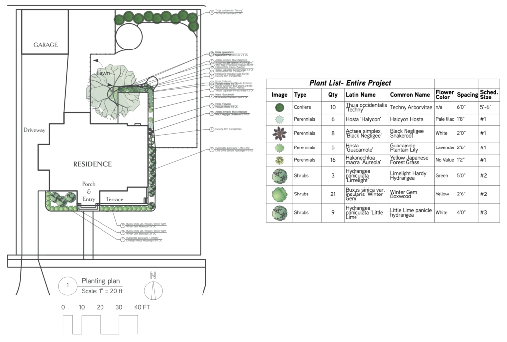
Finally, the planting plan captures every plant we’re using on site and notes all the locations. The planting schedule lists latin and common names, flower information, and spacing. Spacing is so important during planting so that the beds have room for plants to mature. We note the size of the plants at the time of install and ordering. This informs the budget, because larger plants cost more, and it also helps with organizing the planting day.
All these design sheets are organized in our clients’ design book for easy access, and saved to a Dropbox PDF for digital use.
the install

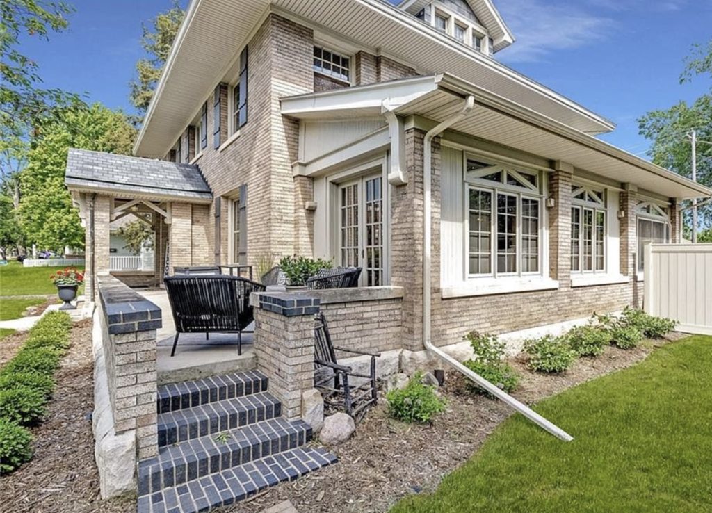
The front yard landscaping is simple, as we planned. The shrubs will grow with time, but not so much that they need regular pruning. We selected a row of boxwoods along the front, with a cluster of large hydrangea on the west side. These won’t block the windows or need attention other than water the first few years. Evergreen, classic and simple, the boxwoods fit our clients’ wish list perfectly.
Smaller ‘Little Lime’ hydrangeas line the east side of the foundation. They’ll create gorgeous cut flower bouquets for inside. Again, we selected plants that won’t outgrow their space or ask for anything from the owners.
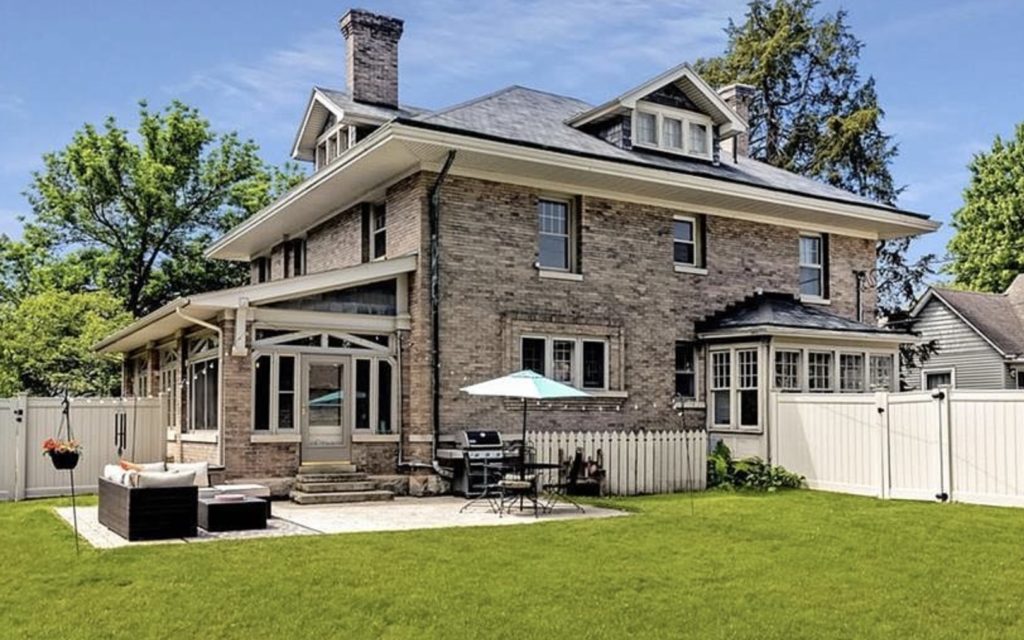
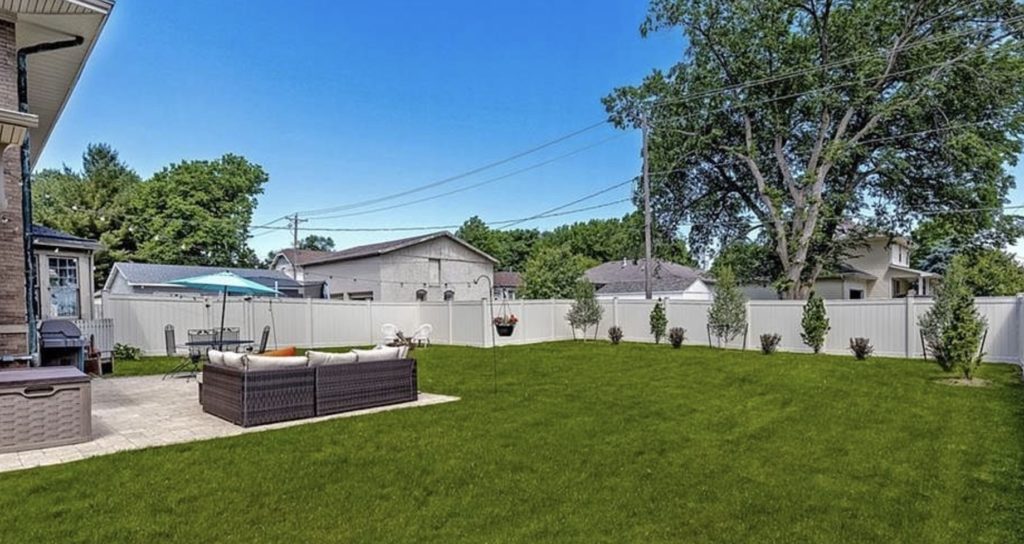
The back yard has been phased in, with the new patio installed, the fence, and the back plantings. The fire pit will be a subsequent phase. The patio has room for the grill, dining, and a lounge area, making it a perfect outdoor room. The rest of the yard is left open for kids to play and larger groups to gather. The fence makes the whole thing feel larger, creating a clear boundary and lovely backdrop.
That’s it! We loved working on this simple makeover. Some small design changes made a huge impact in the curb appeal and functionality of this home. We love how pretty it all was to start with, and how much better we were able to make it.
LIke it
pin it
tweet it
email it